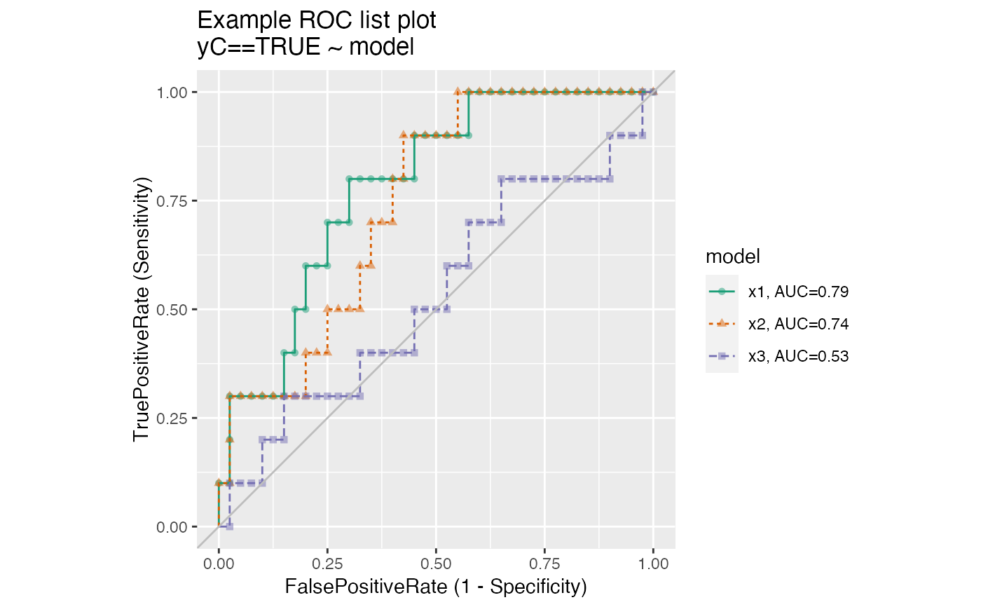
Plot multiple receiver operating characteristic curves from the same data.frame.
ROCPlotPairList(
  frame,
  xvar_names,
  truthVar,
  truthTarget,
  title,
  ...,
  palette = "Dark2"
)
Arguments
| frame | data frame to get values from |
|---|---|
| xvar_names | names of the independent (input or model) columns in frame |
| truthVar | name of the dependent (output or result to be modeled) column in frame |
| truthTarget | value we consider to be positive |
| title | title to place on plot |
| ... | no unnamed argument, added to force named binding of later arguments. |
| palette | name of a brewer palette (NULL for ggplot2 default coloring) |
Details
The use case for this function is to compare the performance of two models when applied to a data set, where the predictions from both models are columns of the same data frame.
If palette is NULL, plot colors will be chosen from the default ggplot2 palette. Setting palette to NULL
allows the user to choose a non-Brewer palette, for example with scale_color_manual.
See also
Examples
set.seed(34903490)
x1 = rnorm(50)
x2 = rnorm(length(x1))
x3 = rnorm(length(x1))
y = 0.2*x2^2 + 0.5*x2 + x1 + rnorm(length(x1))
frm = data.frame(
   x1 = x1,
   x2 = x2,
   x3 = x3,
   yC = y >= as.numeric(quantile(y,probs=0.8)))
WVPlots::ROCPlotPairList(
   frame = frm,
   xvar_names = c("x1", "x2", "x3"),
   truthVar = "yC", truthTarget = TRUE,
   title = "Example ROC list plot")