Plot two receiver operating characteristic curves from different data frames.
ROCPlotPair2(
  nm1,
  frame1,
  xvar1,
  truthVar1,
  truthTarget1,
  nm2,
  frame2,
  xvar2,
  truthVar2,
  truthTarget2,
  title,
  ...,
  estimate_sig = TRUE,
  returnScores = FALSE,
  nrep = 100,
  parallelCluster = NULL,
  palette = "Dark2"
)
Arguments
| nm1 | name of first model |
|---|---|
| frame1 | data frame to get values from |
| xvar1 | name of the first independent (input or model) column in frame |
| truthVar1 | name of the dependent (output or result to be modeled) column in frame |
| truthTarget1 | value we consider to be positive |
| nm2 | name of second model |
| frame2 | data frame to get values from |
| xvar2 | name of the first independent (input or model) column in frame |
| truthVar2 | name of the dependent (output or result to be modeled) column in frame |
| truthTarget2 | value we consider to be positive |
| title | title to place on plot |
| ... | no unnamed argument, added to force named binding of later arguments. |
| estimate_sig | logical, if TRUE estimate and display significance of difference from AUC 0.5. |
| returnScores | logical if TRUE return detailed permutedScores |
| nrep | number of permutation repetitions to estimate p values. |
| parallelCluster | (optional) a cluster object created by package parallel or package snow. |
| palette | name of Brewer palette to color curves (can be NULL) |
Details
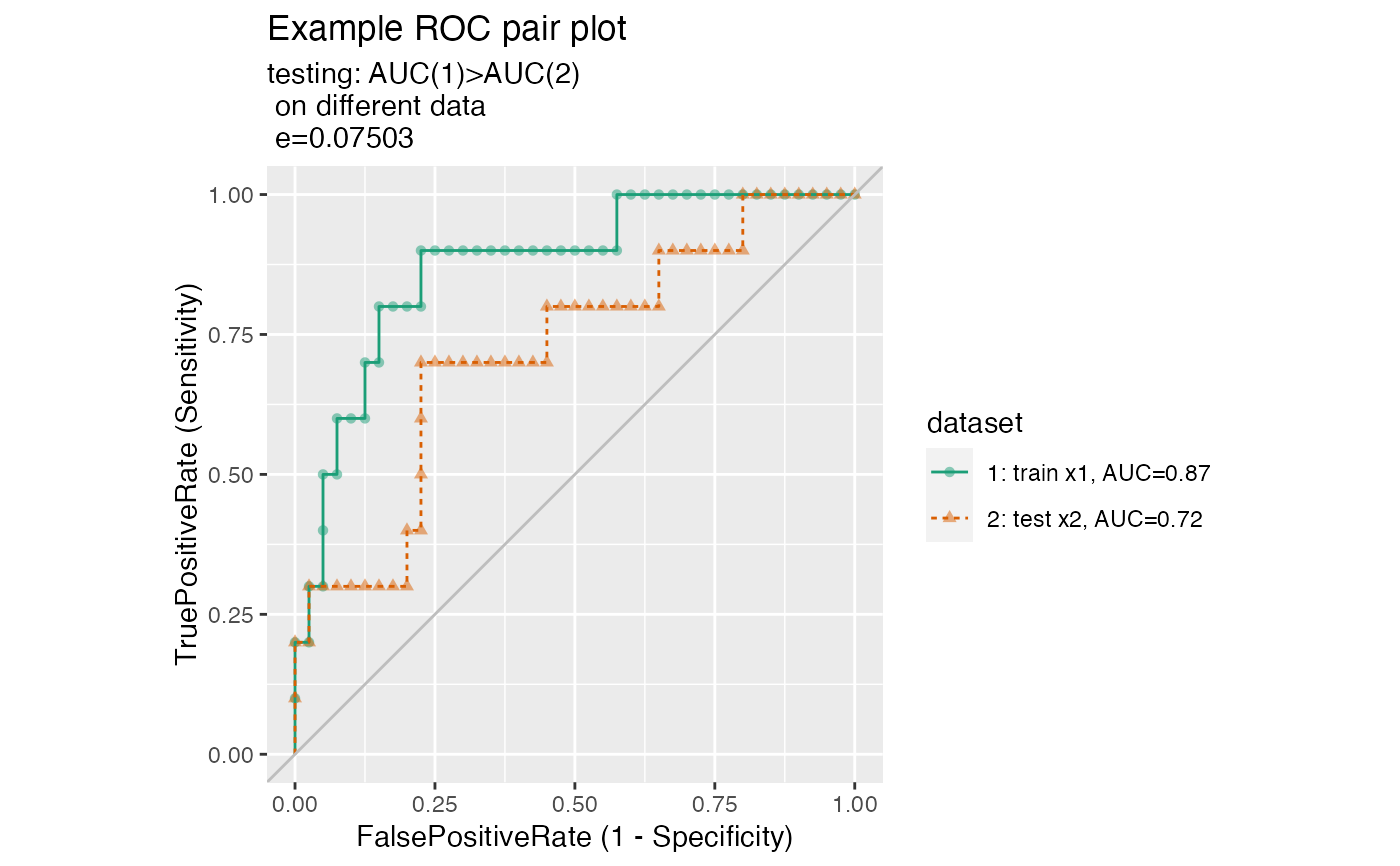
Use this curve to compare model predictions to true outcome from two data frames, each of which has its own model predictions and true outcome columns.
If palette is NULL, plot colors will be chosen from the default ggplot2 palette. Setting palette to NULL
allows the user to choose a non-Brewer palette, for example with scale_color_manual.
See also
Examples
set.seed(34903490)
x1 = rnorm(50)
x2 = rnorm(length(x1))
y = 0.2*x2^2 + 0.5*x2 + x1 + rnorm(length(x1))
frm = data.frame(x1=x1,x2=x2,yC=y>=as.numeric(quantile(y,probs=0.8)))
# WVPlots::ROCPlot(frm, "x1", "yC", TRUE, title="Example ROC plot")
# WVPlots::ROCPlot(frm, "x2", "yC", TRUE, title="Example ROC plot")
WVPlots::ROCPlotPair2('train',frm, "x1", "yC", TRUE,
                      'test', frm, "x2", "yC", TRUE,
                      title="Example ROC pair plot", estimate_sig = TRUE)