Plot Precision-Recall or Enrichment-Recall as a function of threshold.
Source:R/PRTPlot.R
PRTPlot.RdPlot classifier performance metrics as a function of threshold.
PRTPlot(
  frame,
  predVar,
  truthVar,
  truthTarget,
  title,
  ...,
  plotvars = c("precision", "recall"),
  thresholdrange = c(-Inf, Inf),
  linecolor = "black"
)
Arguments
| frame | data frame to get values from |
|---|---|
| predVar | name of the column of predicted scores |
| truthVar | name of the column of actual outcomes in frame |
| truthTarget | value we consider to be positive |
| title | title to place on plot |
| ... | no unnamed argument, added to force named binding of later arguments. |
| plotvars | variables to plot, must be at least one of the measures listed below. Defaults to c("precision", "recall") |
| thresholdrange | range of thresholds to plot. |
| linecolor | line color for the plot |
Details
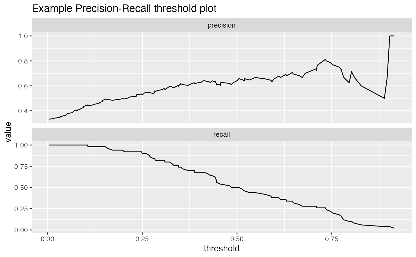
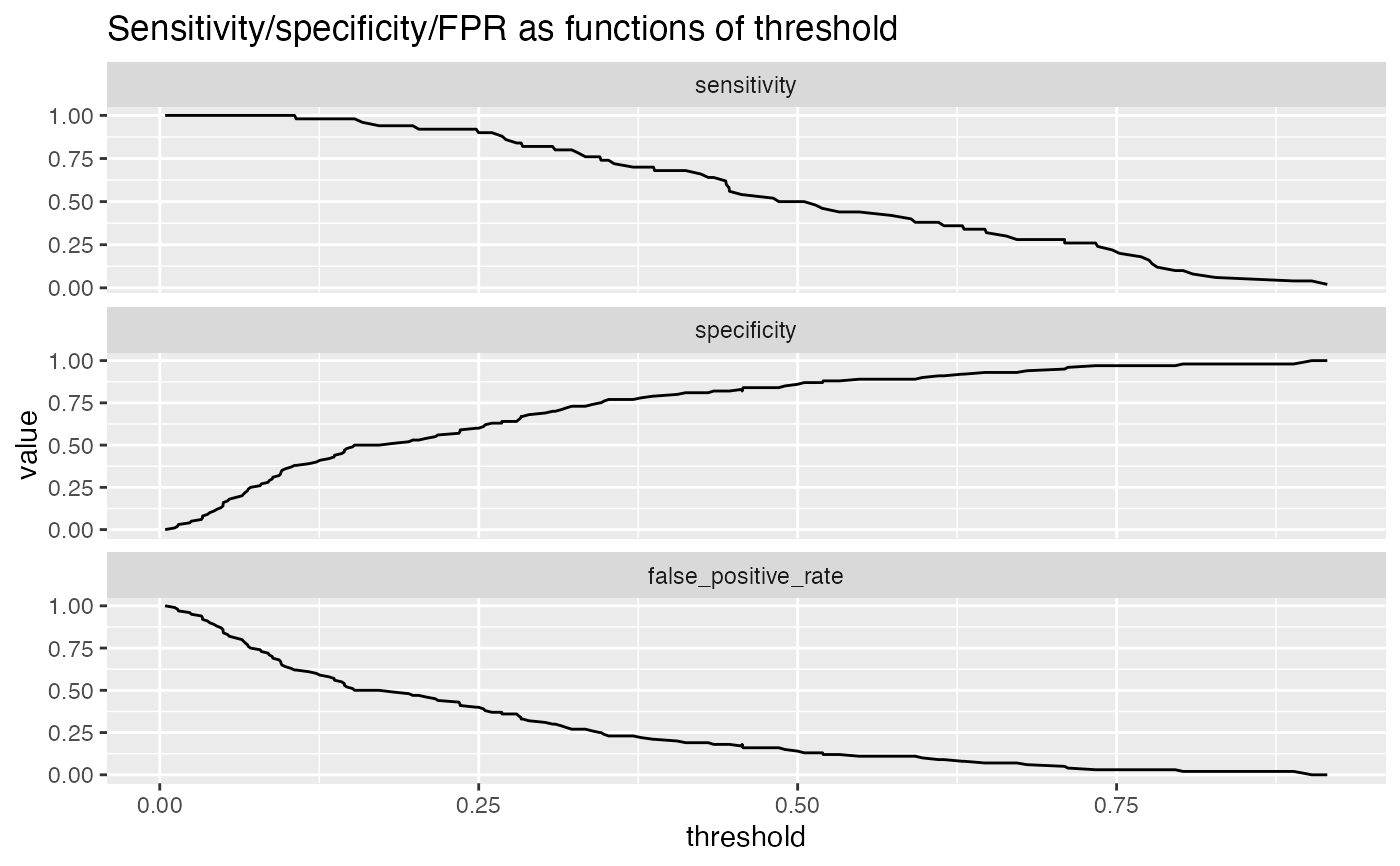
For a classifier, the precision is what fraction of predicted positives are true positives; the recall is what fraction of true positives the classifier finds, and the enrichment is the ratio of classifier precision to the average rate of positives. Plotting precision-recall or enrichment-recall as a function of classifier score helps identify a score threshold that achieves an acceptable tradeoff between precision and recall, or enrichment and recall.
In addition to precision/recall, PRTPlot can plot a number of other metrics:
precision: fraction of predicted positives that are true positives
recall: fraction of true positives that were predicted to be true
enrichment: ratio of classifier precision to prevalence of positive class
sensitivity: the same as recall (also known as the true positive rate)
specificity: fraction of true negatives to all negatives (or 1 - false_positive_rate)
false_positive_rate: fraction of negatives predicted to be true over all negatives
For example, plotting sensitivity/false_positive_rate as functions of threshold will "unroll" an ROC Plot.
Plots are in a single column, in the order specified by plotvars.
See also
Examples
df <- iris df$isVersicolor <- with(df, Species=='versicolor') model = glm(isVersicolor ~ Petal.Length + Petal.Width + Sepal.Length + Sepal.Width, data=df, family=binomial) df$pred = predict(model, newdata=df, type="response") WVPlots::PRTPlot(df, "pred", "isVersicolor", TRUE, title="Example Precision-Recall threshold plot")WVPlots::PRTPlot(df, "pred", "isVersicolor", TRUE, plotvars = c("sensitivity", "specificity", "false_positive_rate"), title="Sensitivity/specificity/FPR as functions of threshold")