Plot empirical rate data as a density with the matching beta distribution
Source:R/DistributionPlot.R
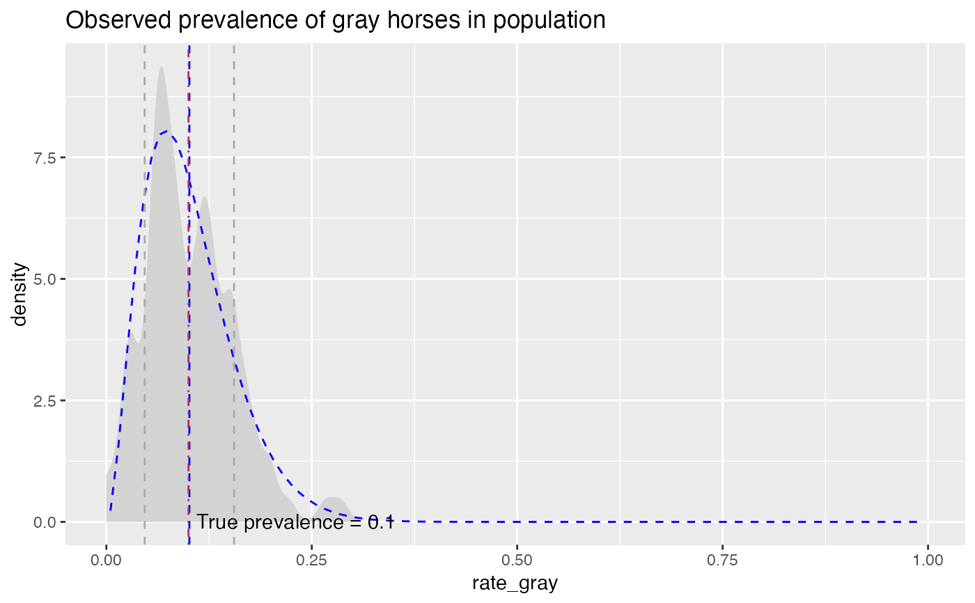
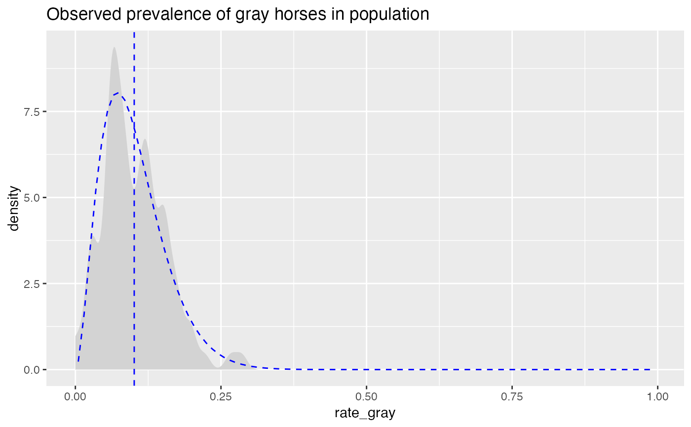
PlotDistDensityBeta.RdCompares empirical rate data to a beta distribution with the same mean and standard deviation.
PlotDistDensityBeta(
  frm,
  xvar,
  title,
  ...,
  curve_color = "lightgray",
  beta_color = "blue",
  mean_color = "blue",
  sd_color = "darkgray"
)
Arguments
| frm | data frame to get values from |
|---|---|
| xvar | name of the independent (input or model) column in frame |
| title | title to place on plot |
| ... | force later arguments to bind by name |
| curve_color | color for empirical density curve |
| beta_color | color for matching theoretical beta |
| mean_color | color for mean line |
| sd_color | color for 1-standard deviation lines (can be NULL) |
Details
Plots the empirical density, the theoretical matching beta, the mean value, and plus/minus one standard deviation from the mean.
Examples
set.seed(52523) N = 100 pgray = 0.1 # rate of gray horses in the population herd_size = round(runif(N, min=25, 50)) ngray = rbinom(N, herd_size, pgray) hdata = data.frame(n_gray=ngray, herd_size=herd_size) # observed rate of gray horses in each herd hdata$rate_gray = with(hdata, ngray/herd_size) title = "Observed prevalence of gray horses in population" PlotDistDensityBeta(hdata, "rate_gray", title) + ggplot2::geom_vline(xintercept = pgray, linetype=4, color="maroon") + ggplot2::annotate("text", x=pgray+0.01, y=0.01, hjust="left", label = paste("True prevalence =", pgray))# no sd lines PlotDistDensityBeta(hdata, "rate_gray", title, sd_color=NULL)