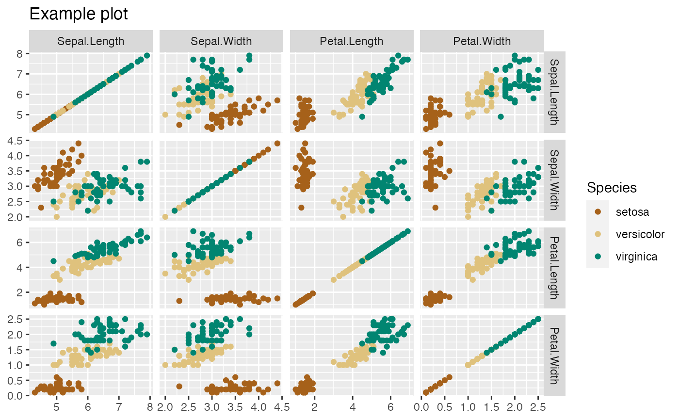
Creates a matrix of scatterplots, one for each possible pair of variables.
PairPlot(
  d,
  meas_vars,
  title,
  ...,
  group_var = NULL,
  alpha = 1,
  palette = "Dark2",
  point_color = "darkgray"
)
Arguments
| d | data frame |
|---|---|
| meas_vars | the variables to be plotted |
| title | plot title |
| ... | not used, forces later arguments to bind by name |
| group_var | variable for grouping and colorcoding |
| alpha | alpha for points on plot |
| palette | name of a brewer palette (NULL for ggplot2 default coloring) |
| point_color | point color for monochrome plots (no grouping) |
Value
a ggplot2 pair plot
Details
If palette is NULL, and group_var is non-NULL, plot colors will be chosen from the default ggplot2 palette.
Setting palette to NULL
allows the user to choose a non-Brewer palette, for example with scale_color_manual.
Examples
# PairPlot(iris, colnames(iris)[1:4], "Example plot", group_var = "Species") # custom palette colormap = c('#a6611a', '#dfc27d', '#018571') PairPlot(iris, colnames(iris)[1:4], "Example plot", group_var = "Species", palette=NULL) + ggplot2::scale_color_manual(values=colormap)# # no color-coding # PairPlot(iris, colnames(iris)[1:4], "Example plot")