Plot the cumulative lift curves of a sort-order.
LiftCurvePlotList(
  frame,
  xvars,
  truthVar,
  title,
  ...,
  truth_target = NULL,
  palette = "Dark2"
)

LiftCurveListPlot(
  frame,
  xvars,
  truthVar,
  title,
  ...,
  truth_target = NULL,
  palette = "Dark2"
)
Arguments
| frame | data frame to get values from |
|---|---|
| xvars | name of the independent (input or model score) columns in frame |
| truthVar | name of the dependent (output or result to be modeled) column in frame |
| title | title to place on plot |
| ... | no unnamed argument, added to force named binding of later arguments. |
| truth_target | if not NULL compare to this scalar value. |
| palette | color palette for the model curves |
Details
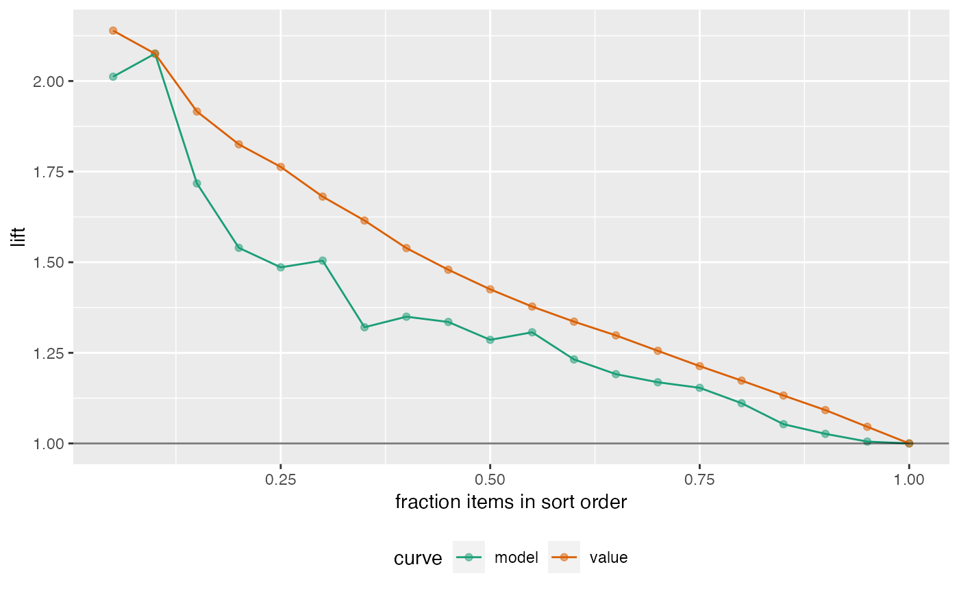
The use case for this visualization is to compare a predictive model score to an actual outcome (either binary (0/1) or continuous). In this case the lift curve plot measures how well the model score sorts the data compared to the true outcome value.
The x-axis represents the fraction of items seen when sorted by score, and the y-axis represents the lift seen so far (cumulative value of model over cummulative value of random selection)..
Examples
set.seed(34903490)
y = abs(rnorm(20)) + 0.1
x = abs(y + 0.5*rnorm(20))
frm = data.frame(model=x, value=y)
WVPlots::LiftCurvePlotList(frm, c("model", "value"), "value",
   title="Example Continuous Lift Curves")