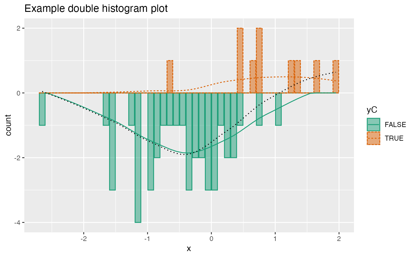
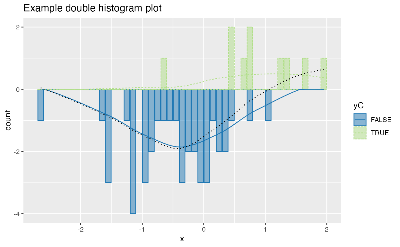
Plot two histograms conditioned on an outcome variable.
Source:R/DoubleHistogram.R
DoubleHistogramPlot.RdPlot two histograms conditioned on a binary outcome variable.
DoubleHistogramPlot(
  frame,
  xvar,
  truthVar,
  title,
  ...,
  palette = "Dark2",
  breaks = 40
)
Arguments
| frame | data frame to get values from |
|---|---|
| xvar | name of the independent (input or model) column in frame |
| truthVar | name of the dependent (output or result to be modeled) column in frame |
| title | title to place on plot |
| ... | no unnamed argument, added to force named binding of later arguments. |
| palette | name of Brewer palette (can be NULL) |
| breaks | breaks to pass to histogram |
Details
To distinguish the two conditions, one histogram is plotted upside-down.
The use case for this visualization is to plot a predictive model score (usually the predicted probability of a desired outcome) conditioned on the actual outcome. However, you can use it to compare any numerical quantity conditioned on a binary feature.
If palette is NULL, plot colors will be chosen from the default ggplot2 palette. Setting palette to NULL
allows the user to choose a non-Brewer palette, for example with scale_fill_manual.
Examples
set.seed(34903490) x = rnorm(50) y = 0.5*x^2 + 2*x + rnorm(length(x)) frm = data.frame(x=x,y=y,yC=y>=as.numeric(quantile(y,probs=0.8))) frm$absY <- abs(frm$y) frm$posY = frm$y > 0 frm$costX = 1 WVPlots::DoubleHistogramPlot(frm, "x", "yC", title="Example double histogram plot")# redo the plot with a custom palette plt = WVPlots::DoubleHistogramPlot(frm, "x", "yC", palette=NULL, title="Example double histogram plot") cmap = c("TRUE" = "#b2df8a", "FALSE" = "#1f78b4") plt + ggplot2::scale_color_manual(values=cmap) + ggplot2::scale_fill_manual(values=cmap)

