Plot a history of model fit performance over the number of training epochs.
plot_Keras_fit_trajectory(
  d,
  title,
  ...,
  epoch_name = "epoch",
  lossname = "loss",
  loss_pretty_name = "minus binary cross entropy",
  perfname = "acc",
  perf_pretty_name = "accuracy",
  pick_metric = loss_pretty_name,
  fliploss = TRUE,
  discount_rate = NULL,
  draw_ribbon = FALSE,
  val_color = "#d95f02",
  train_color = "#1b9e77",
  pick_color = "#e6ab02"
)
Arguments
| d | data frame to get values from. |
|---|---|
| title | character title for plot. |
| ... | force later arguments to be bound by name |
| epoch_name | name for epoch or trajectory column. |
| lossname | name of training loss column (default 'loss') |
| loss_pretty_name | name for loss on graph (default 'minus binary cross entropy') |
| perfname | name of training performance column (default 'acc') |
| perf_pretty_name | name for performance metric on graph (default 'accuracy') |
| pick_metric | character: metric to maximize (NULL for no pick line - default loss_pretty_name) |
| fliploss | flip the loss so that "larger is better"? (default TRUE) |
| discount_rate | numeric: what fraction of over-fit to subtract from validation performance. |
| draw_ribbon | present the difference in training and validation performance as a ribbon rather than two curves? (default FALSE) |
| val_color | color for validation performance curve |
| train_color | color for training performance curve |
| pick_color | color for indicating optimal stopping point |
Value
ggplot2 plot
Details
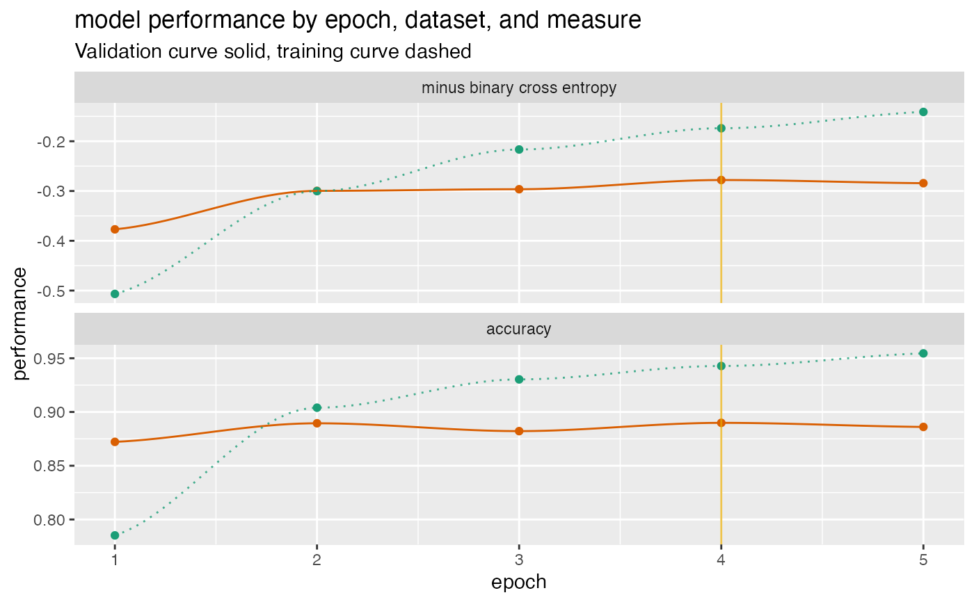
Assumes a performance matrix that carries information for both training and validation loss, and an additional training and validation performance metric, in the format that a Keras history object returns.
By default, flips the loss so that better performance is larger for both the loss and the performance metric, and then draws a vertical line at the minimum validation loss (maximum flipped validation loss). If you choose not to flip the loss, you should not use the loss as the pick_metric.
The example below gives a fit plot for a history report from Keras R package. Please see https://winvector.github.io/FluidData/PlotExample/KerasPerfPlot.html for some details.
See also
Examples
# example data (from Keras) d <- data.frame( val_loss = c(0.3769818, 0.2996994, 0.2963943, 0.2779052, 0.2842501), val_acc = c(0.8722000, 0.8895000, 0.8822000, 0.8899000, 0.8861000), loss = c(0.5067290, 0.3002033, 0.2165675, 0.1738829, 0.1410933), acc = c(0.7852000, 0.9040000, 0.9303333, 0.9428000, 0.9545333) ) plt <- plot_Keras_fit_trajectory( d, title = "model performance by epoch, dataset, and measure") suppressWarnings(print(plt)) # too few points for loess#>#>